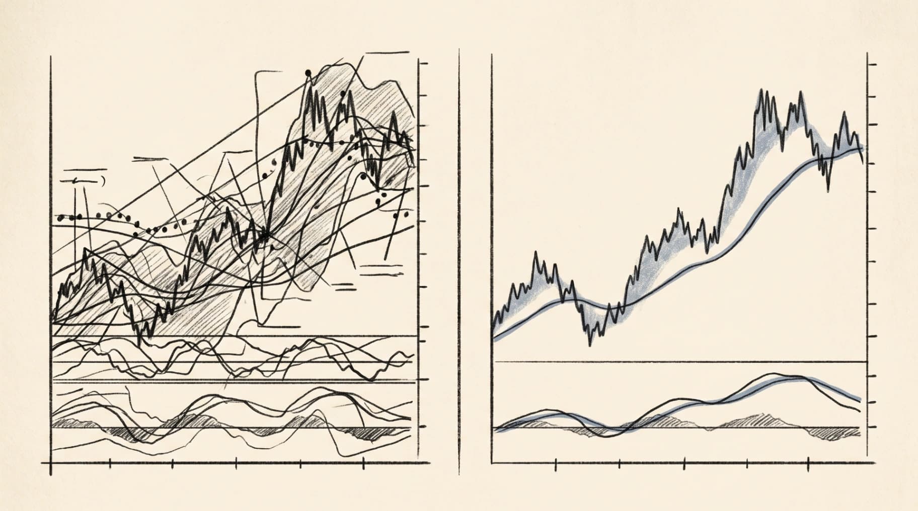
Open ten stock charting software reviews and you will read the same sentence with different numbers attached. Three hundred indicators. Four hundred indicators. A community library of scripts numbering in the hundreds of thousands. Charting software is sold the way a kitchen gadget is sold, on the length of the feature list, not on whether it helps you cook dinner.
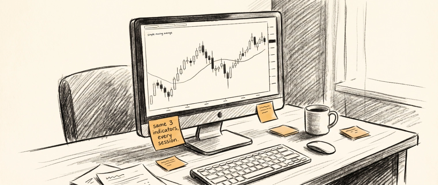
The traders who actually use their charts well are rarely the ones running every indicator at once. They are running two or three, consistently, on a platform that gets out of their way. That gap between what gets marketed and what gets used is worth pausing on before choosing a tool.
The indicator count is a distraction
An indicator library is easy to advertise and hard to evaluate. A platform with 400 indicators sounds more capable than one with 40, but most traders settle into a small, repeatable set within a few months of active use. Moving averages, a volume overlay, maybe one oscillator. The rest of the library sits unused.
What actually determines whether a chart helps you is closer to the workflow questions from trading chart patterns: can you tell a high quality setup from a familiar shape that happens to look similar? A bigger indicator library does not answer that question. Context does, and context comes from how the chart is read, not how many overlays sit on top of it.
Speed matters more than it gets credit for
Charting software that lags, even by a second or two, changes how a trader behaves. A candle closes, the chart is slow to update, and a decision gets made on stale information without anyone noticing it happened. This is a quieter problem than most reviews cover, because it does not show up in a feature comparison table. It shows up in execution, which is much harder to screenshot.
Real time responsiveness is also where a lot of free charting tools fall short once volume picks up, particularly around market open. If a platform slows down exactly when precision matters most, the rest of its feature list stops being relevant.
Multi timeframe context, not multi timeframe clutter
Most charting platforms let you open several timeframes at once. Far fewer make it easy to actually use that view without losing track of which chart you are looking at. A four panel layout with a daily, four hour, one hour, and five minute chart sounds thorough. In practice it often becomes four charts competing for attention instead of one coherent read of the market.
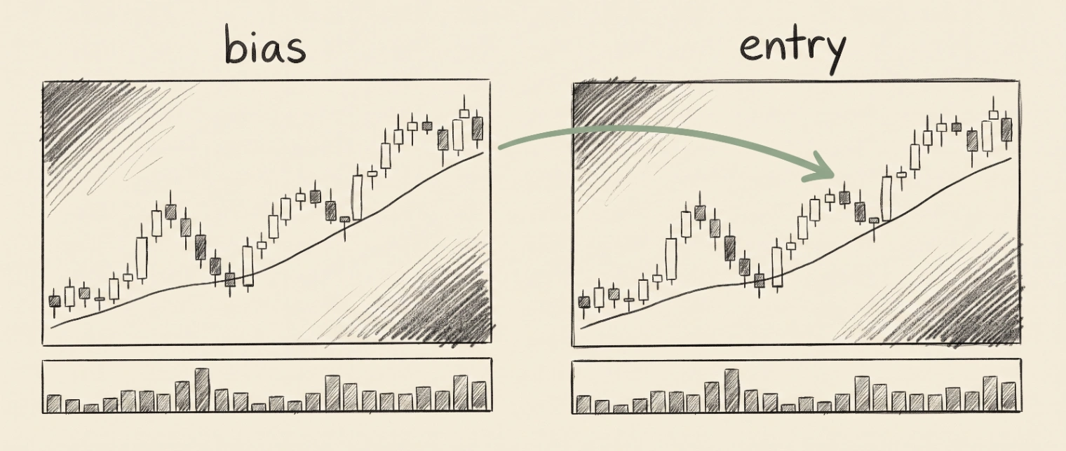
The traders who read multiple timeframes well tend to keep the structure simple: one higher timeframe for bias, one execution timeframe for entries. That discipline usually says more about the trader than the software, but software that makes it easy to keep that structure clean is doing its job. Software that buries it under panel management is not.
Where charting and journaling stop being separate tools
Charting software shows you the market. It does not, on its own, show you how you tend to act on what you see. That second layer is where a lot of traders discover their charting tool was never going to be enough by itself. You can have a technically correct read on a chart and still act on it inconsistently, entering the same setup differently depending on the day, the mood, or the last trade.
This is the gap that connects charting to journaling. A chart tells you what happened in the market. A journal, especially one built around the same setups you are charting, tells you what you tend to do about it. Building a trading watchlist around the setups that actually work for you, and reviewing them consistently, does more for long term improvement than any indicator upgrade.
Platforms that connect charting with performance analytics, rather than treating them as separate products, close that gap directly. Smart trading analytics built on top of your own chart history turns a static chart into a record you can actually learn from.
What to actually look for
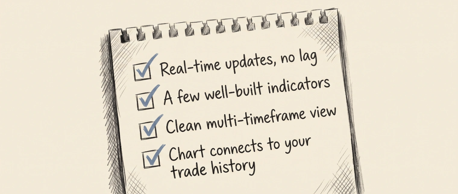
Strip away the marketing and a short checklist holds up better than a feature count:
Charts that update in real time without lag, especially around market open
A small set of indicators that are genuinely well built rather than a large set that is generic
Multi timeframe views that stay easy to read at a glance
A clean path from "what the chart shows" to "what I actually did about it"
That last point is the one most charting software skips entirely, because charting and journaling have historically been sold as separate categories. They do not have to be.
FAQ
Is more indicators always better in stock charting software?
No. Most active traders settle into a small, repeatable set of indicators. A large library is easy to market but rarely changes how well a trader reads a chart day to day.
What is the biggest overlooked factor in choosing charting software?
Real time responsiveness, particularly around high volume periods like market open. A lag of even a second or two can quietly change decisions without the trader noticing.
Should charting software and a trading journal be separate tools?
They can be, but keeping them connected makes it far easier to see the link between what a chart showed and how a trader actually responded to it over time.
How many timeframes should a trader realistically watch at once?
Two is usually enough for most strategies: one higher timeframe for overall bias and one execution timeframe for entries. More timeframes often add clutter rather than clarity.